


In 1962, Mark Rothko walked into Sidney Janis Gallery in New York and saw the new generation taking over: Andy Warhol, Roy Lichtenstein, Claes Oldenburg and the artists who would soon define American Pop Art.
He wasn't impressed. Rothko called the new Pop artists “charlatans and young opportunists” and, after seeing the work, asked: “Are these young artists plotting to kill us all?” A little later, when painter Ruth Kligman tried to introduce him to Warhol in Greenwich Village, Rothko simply walked away without a word.
More than sixty years later, Rothko and Warhol are both still everywhere.
That's probably more useful than any list of this year's wall-art trends.
Styles don't last because they're declared tasteful at the right moment.
The good ones survive because they continue to do something specific: Rothko can lower the volume of a room; Warhol can raise it.
So rather than chasing whatever is currently filling Instagram feeds, these are ten wall-art styles with enough history behind them to trust — and what each one can actually bring to a space.
1. Color field & Abstract Expressionism
The problem with abstract art isn't abstract art. It's the endless beige approximation of it.
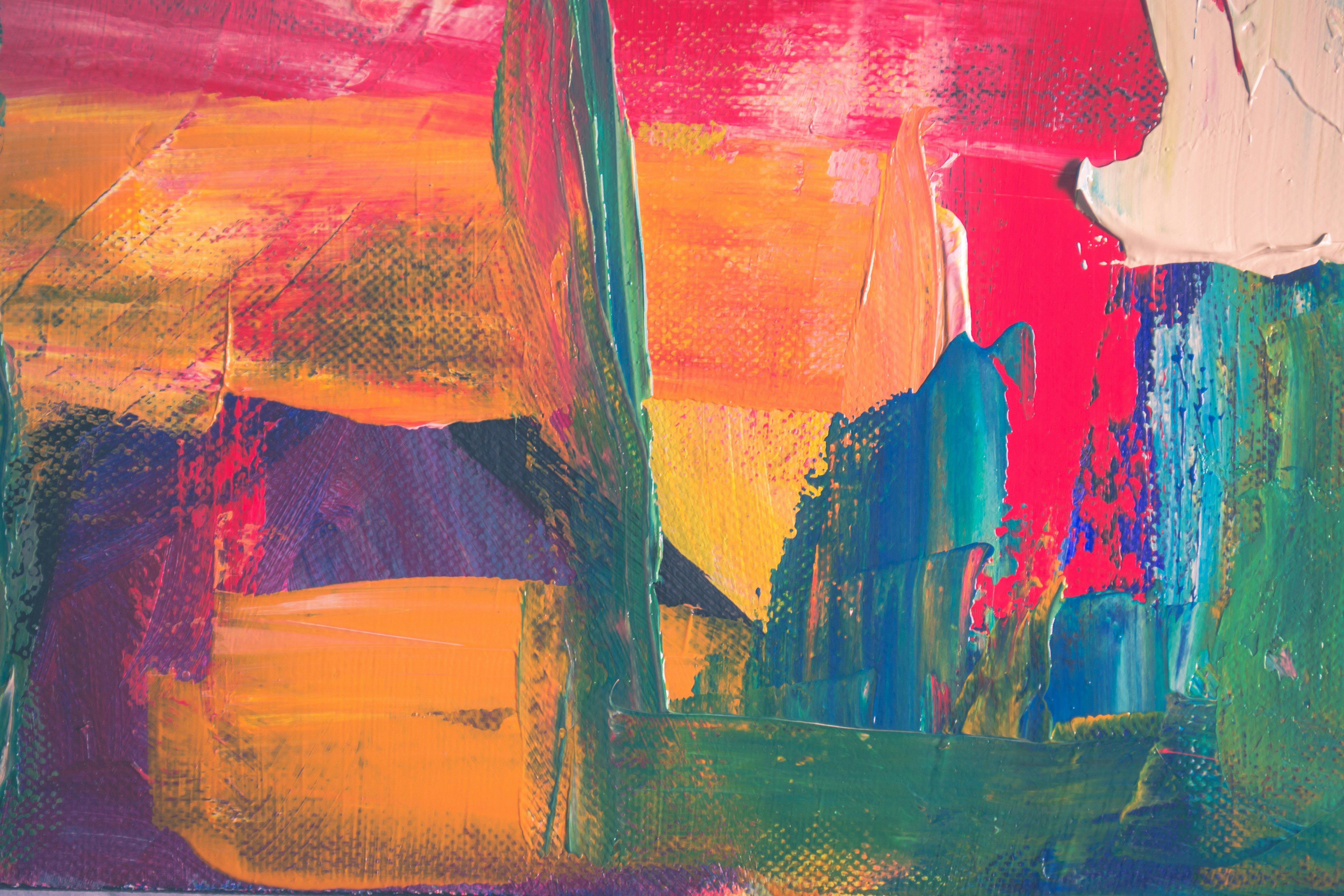
Color field painting emerged in the 1950s and '60s around artists including Rothko, Barnett Newman and Helen Frankenthaler. Instead of filling the canvas with subjects and detail, these painters let large areas of color become the subject itself. MoMA defines the style by expansive fields of color with little tonal contrast or obvious focal point.
That's why it still works so naturally in interiors. A large burgundy, muddy green or deep-blue field can introduce a huge amount of color without adding much visual noise. It suits rooms that already contain books, objects, patterned furniture or anything else competing for attention.
Scale matters more here than with almost any other style. A small color-field image can easily become another rectangle hanging on a wall; blown up, the color starts affecting the whole room. For this kind of work, we'd usually lean toward a large stretched canvas at Printseekers rather than surrounding it with a heavy frame. The less interruption around the image, the more it behaves like part of the wall itself.
2. Pop Art
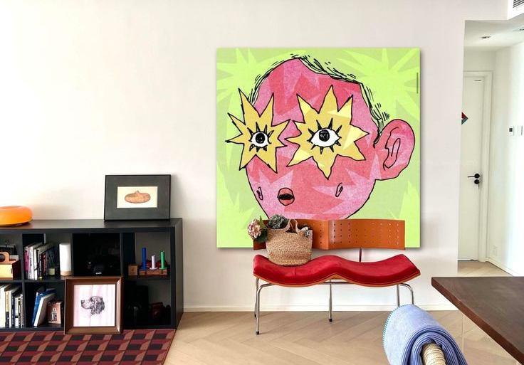
Pop Art did almost the exact opposite. It borrowed from advertising, comic books, television, celebrities, product packaging and the visual noise of everyday consumer culture. Warhol's soup cans and Marilyns, Lichtenstein's comic panels and Claes Oldenburg's enlarged everyday objects turned what museums had previously considered “low” imagery into fine art.
In an interior, Pop works best when the room around it isn't also trying to be Pop.
A bright commercial image, oversized type or hard block of red can wake up a room full of dark wood, neutral upholstery or serious furniture. One piece gives the room humor and friction; five pieces next to a bright-red chair and a novelty lamp start looking like a themed bar.
It also tends to benefit from a less precious print treatment. Pop came from mass culture, so saturated color, glossy paper or even metal can feel more convincing than making it whisper on tasteful cream stock.
Rothko would probably hate that, which is part of the appeal.
3. Photography
Photography is less a style than an entire language.
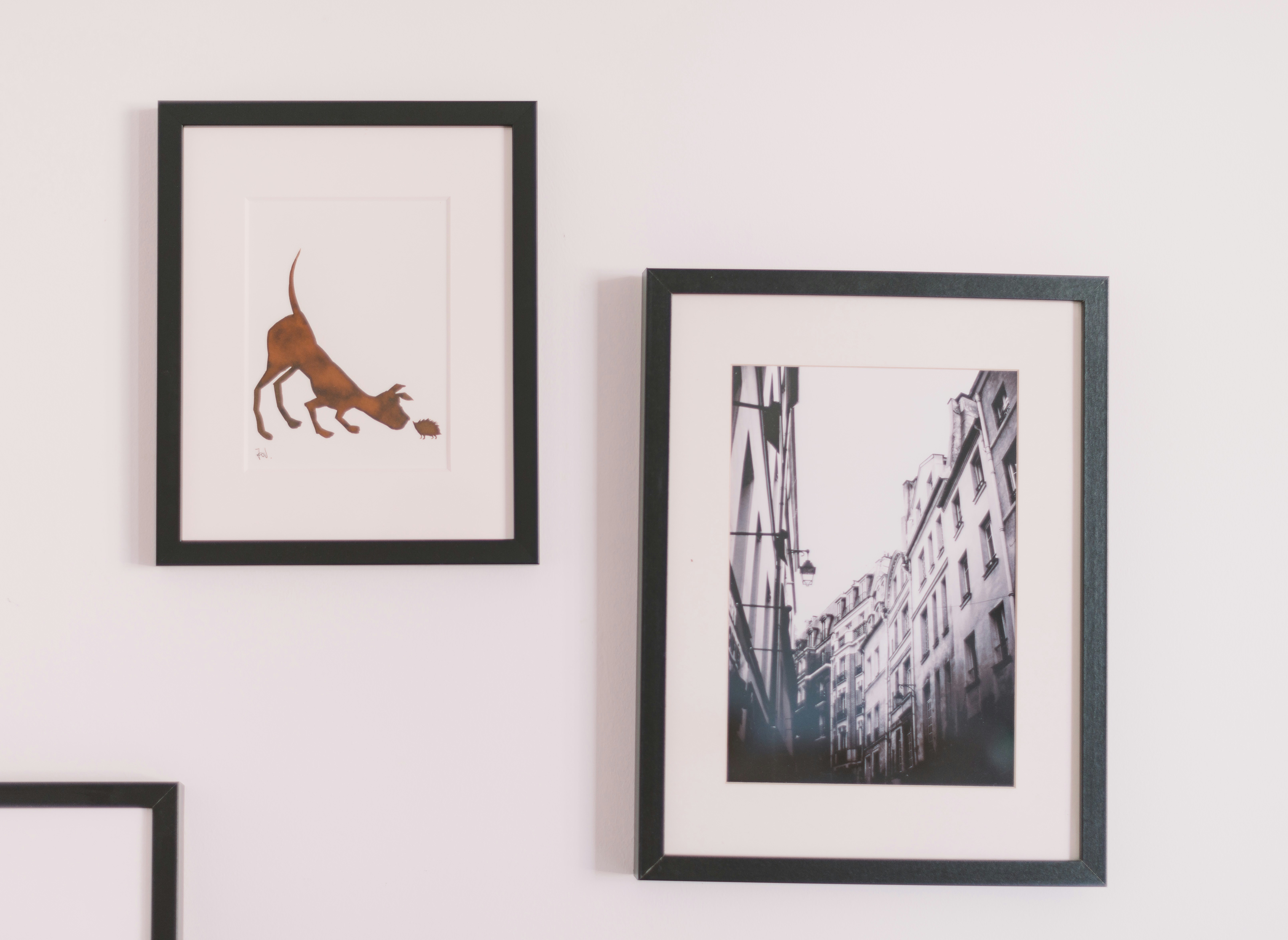
Black-and-white street photography, architectural studies, saturated fashion images, landscapes, flash photography and quiet documentary work can all change a room in completely different ways. Since its invention, photography has moved between documentation and interpretation; MoMA describes it as both a way of recording the world and a medium shaped by the photographer's choices about how that world is represented.
Black and white is useful when the room already has enough color. Architectural photography introduces structure. Fashion photography can make a space feel slightly editorial, while landscape photography gives the eye somewhere beyond the four walls to travel.
Photography is also where the physical print matters most. MoMA's own research into historic photographic prints treats the image as a physical object whose paper, surface and production method are part of how it is experienced.
That's something you can use at home too. At Printseekers, the same photograph can become a soft matte fine-art poster, a punchier glossy print or a much harder, more architectural metal print. Don't choose the material after you've chosen the image as an afterthought — they're part of the same decision.
And before buying another photograph, check your camera roll. The strange hotel, empty beach or badly lit street you photographed three years ago might be better on your wall precisely because nobody else has it.
4. Vintage posters
Posters have an advantage over many other forms of wall art: most of them were never trying to be wall art in the first place.
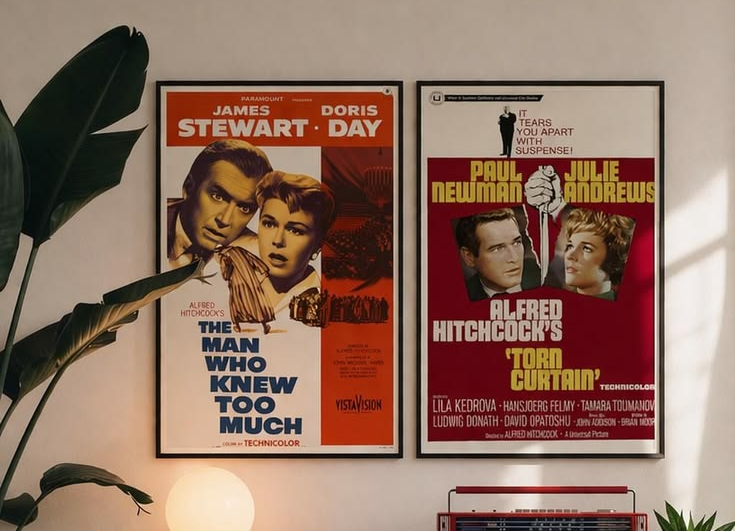
They advertised exhibitions, theatre, railways, films, products and places. Their job was to make someone stop, look and remember something. That's why the best ones still have unusually strong typography, color and composition.
Henri de Toulouse-Lautrec is one of the clearest examples. His late-19th-century Paris posters borrowed flattened color, dramatic contours and unusual cropping from Japanese ukiyo-e prints, helping commercial advertising become something people would eventually preserve in museums.
Vintage posters are particularly good in very contemporary rooms. An old exhibition graphic above stainless steel, or a faded railway poster beside a clean modern sofa, gives the room history without turning it traditional.
The thing to avoid is decorating around the subject too literally. One Italian travel poster can be great. Six Amalfi posters beside a lemon bowl and striped umbrella print becomes a restaurant concept.
Choose the graphic, not the fantasy lifestyle printed on it.
5. Still life
A bowl of fruit has survived several hundred years of art history. That's worth paying attention to.
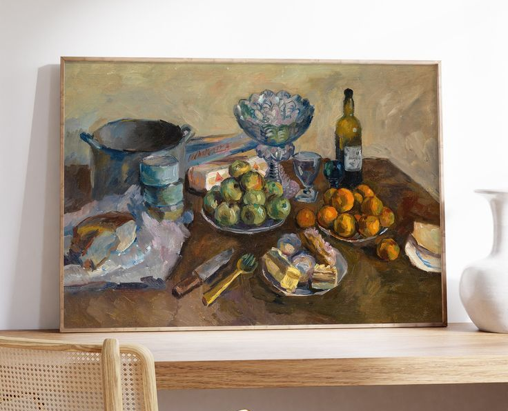
Still life was once considered one of painting's least prestigious genres because it dealt with ordinary objects rather than grand historical or religious subjects. Cézanne spent years making that distinction look ridiculous. He repeatedly rearranged fruit, cloth, bowls and objects from his studio, using them to experiment with balance, color and different viewpoints.
Still life works well at home because it already speaks the language of domestic spaces. Flowers, books, glasses and food don't feel imported into a room; they already belong there.
Where it becomes interesting is contrast. A dark, traditional still life in a minimalist kitchen. Cézanne above a chrome table. A floral painting surrounded by very modern furniture. Older art can make new furniture look newer, while the contemporary room stops the painting from feeling overly formal.
It doesn't need to look antique just because the subject is.
6. Japanese woodblock prints
Ukiyo-e prints were mass-produced popular culture long before anyone used that term.
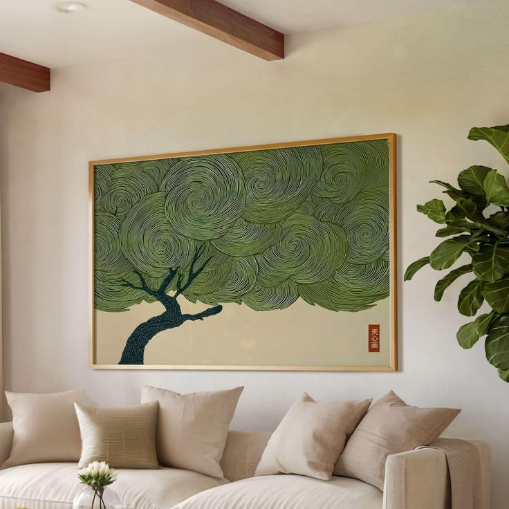
Produced during Japan's Edo period, they depicted landscapes, actors, city life and everyday subjects. When large numbers of Japanese prints reached Europe in the 19th century, their flattened perspective, unusual cropping and strong outlines had an enormous influence on artists including Toulouse-Lautrec, Bonnard and Vuillard.
That's part of why they still sit so easily beside modern design. A Hiroshige landscape can look completely comfortable above simple contemporary furniture because so much Western modernism eventually absorbed lessons from Japanese composition.
The obvious mistake is turning that into a “Japanese interior.” You don't need paper lanterns and a bonsai tree because you hung Hokusai.
Let the print be the reference.
7. Surrealism
Surrealism is useful when a room is becoming too reasonable.
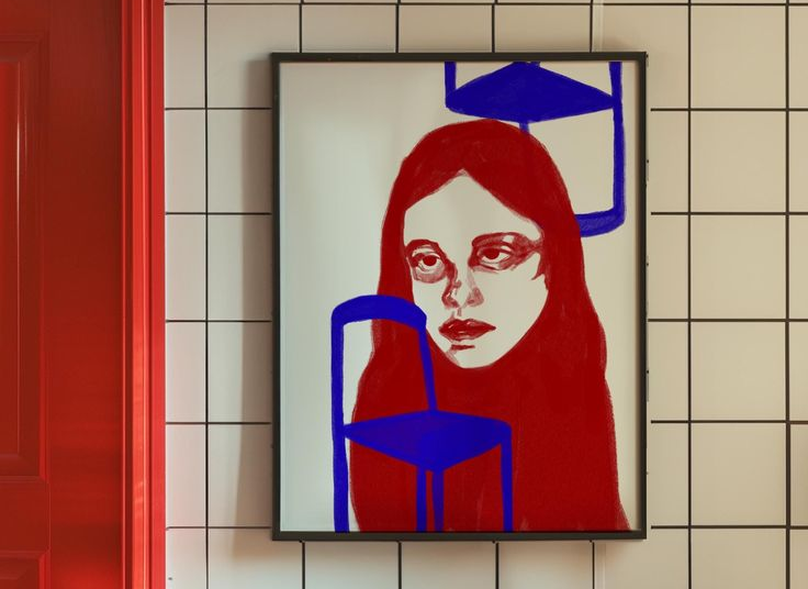
The movement grew in the 1920s around dreams, irrational combinations and the unconscious. The point wasn't simply to make strange-looking things; it was to break the logic people were used to seeing. That idea still runs through contemporary art, fashion and interiors — Vogue was revisiting Surrealism in design again this summer through artists and designers using distortion, humor and unexpected juxtapositions.
Dalí and Magritte are the obvious names, but Leonora Carrington, Dorothea Tanning, Man Ray and Max Ernst open the category much further.
Surreal art is strongest when everything surrounding it behaves normally. A polished dining room with one impossible image has tension. A room packed with melting clocks and eyeballs just tells you the owner likes Surrealism.
One strange thing is usually stranger than ten.
8. Bauhaus & modernist graphics
Some walls don't need another landscape or person. They need structure.
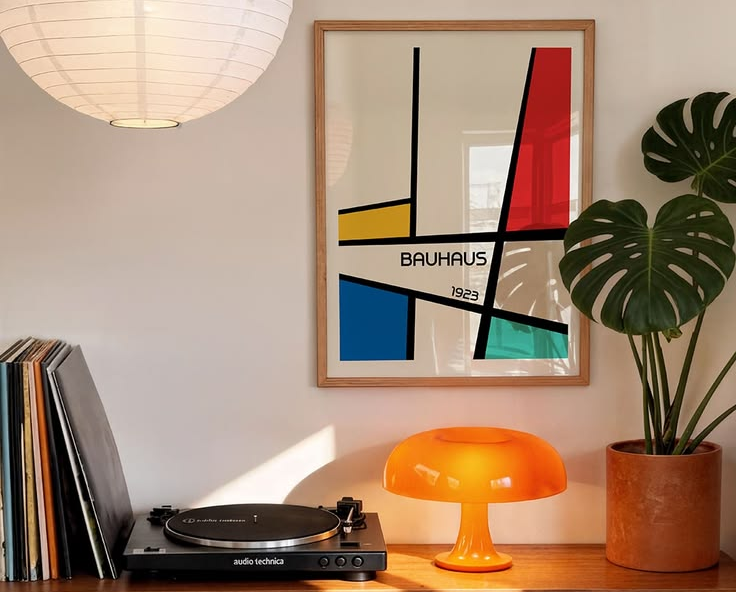
Bauhaus graphic design gave typography, photography and geometry a much more direct relationship. Herbert Bayer, one of the school's most influential designers and teachers, combined typography and photography into graphic compositions and pushed a stripped-back visual language built around clarity rather than decoration.
That still makes Bauhaus and other modernist graphics useful in rooms with softer furniture and organic shapes. Grids, hard circles, typography and blocks of color can create some tension against linen, wood, rugs and curved sofas.
But a Bauhaus poster doesn't require a Bauhaus room. In fact, putting one above an antique table is probably more interesting than hanging it above a Marcel Breuer chair.
The art can reference the architecture without reenacting an entire design movement.
9. Landscape
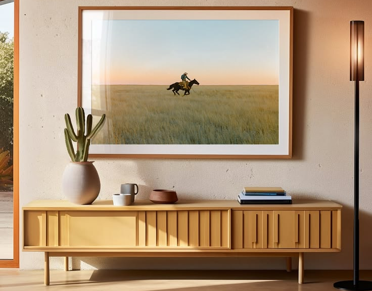
Landscape might be the closest thing wall art has to adding another window.
The genre can mean a 19th-century Romantic painting, a hazy photograph, a Japanese mountain scene or a nearly abstract stretch of sea. What matters in a room is the illusion of somewhere beyond the wall.
A wide landscape works particularly well in spaces that feel enclosed or visually dense. A visible horizon creates distance and gives the eye a place to rest. More dramatic landscapes add energy; quieter, tonal ones can make a room feel less crowded without resorting to another blank abstract.
They also reward size. A landscape printed too small loses the sense of immersion that made you choose it in the first place. On a long wall, this is one of the few subjects where a multipanel canvas can make conceptual sense rather than feeling like a format searching for an image — the horizon can actually continue across the panels.
Don't only look at traditional “beautiful views,” either. Parking lots, motorways, industrial coastlines and empty winter fields can make better landscape art than another perfect sunset.
10. Botanical & scientific illustration
Before photography made documenting the world easy, someone had to draw it.
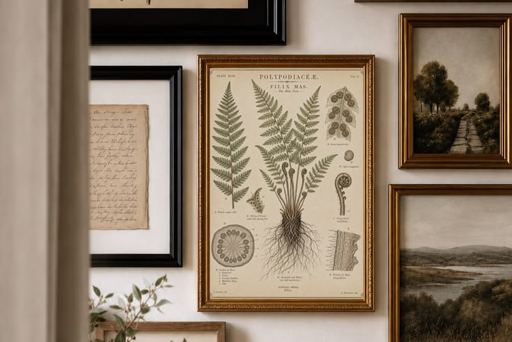
Botanical illustrations, anatomical studies, birds, insects, maps and astronomical diagrams sit somewhere between information and art. Historic natural-history illustrators were expected to observe precisely enough to communicate knowledge while still making images that could be understood and reproduced. The National Gallery of Art describes this tradition as a meeting point between empirical observation and aesthetic judgment.
That practical origin is exactly why the images age so well. A botanical illustration wasn't designed around the color trend of a particular living room. It was trying to show you a plant.
These prints are especially good when modern furniture makes a room feel slightly too new. Put an old scientific diagram above a contemporary desk, or a botanical study beside polished metal and suddenly the space has another layer of time in it.
They also don't need to be styled like a Victorian study. A simple frame keeps the contradiction intact.
So, which style is yours?
Probably not one.
A room doesn't need to identify as Pop Art, Bauhaus or Japanese minimalism. Photography can sit beside an old botanical print; a color field can share a wall with something figurative; an exhibition poster can hang above a piece of furniture designed fifty years later.
The useful question isn't “What wall-art style matches my interior?” It's what the room currently needs.
If it's visually busy, color field or black-and-white photography can lower the noise. If it's too polite, Pop or Surrealism can introduce friction. If everything feels new, still life, vintage posters, woodblock prints or scientific illustration can bring in history. If it's soft and shapeless, modernist graphics can give it structure.
The Vogue 2026 interiors forecast points toward the same broader idea: rooms are becoming more lived-in, personal and less interested in looking perfectly coordinated. That's a much better direction than buying whatever happens to be labeled the wall-art trend of the year.
Rothko thought Pop Art might be coming to kill everything his generation had built. It didn't. Pop stayed, Rothko stayed, and the argument between them became part of why both still feel interesting.
Good art doesn't need to win the trend cycle. It just needs to keep giving the room something.


.png)
.png)
