


Want a calmer room? → larger pieces, low contrast, muted tones.
Want more energy? → saturated color, graphic compositions, stronger contrast.
Want it to feel warmer? → earthy colors, organic imagery, natural frames.
Want it to feel more sophisticated? → fewer, larger pieces, restrained palette, consistent framing.
These rules work.
But the most interesting rooms usually break at least one of them — a huge red canvas that somehow calms a room, a gold frame that looks right next to a chrome lamp.
That's because we never see art in isolation.
Virgil Abloh once made almost exactly this point using a candle. Put it in an all-white gallery and it looks like art; put the same candle in a garage and suddenly it can look like trash.
As he put it: “I can either spend my time designing the candle or I can spend my time designing the room that it sits in.”
The object didn't change. The context did.
Wall art works the same way. We never see a print or canvas in isolation — we see it next to the furniture, under a certain light, inside a frame, surrounded by empty space and everything else already competing for our attention. Change what's on the wall and the whole room can read differently without moving a single piece of furniture.
Here's how that actually works.
Don't match your art to the room. Make it rhyme.
Matching is buying a mid-century print because you have a mid-century sofa.
Rhyming is subtler.
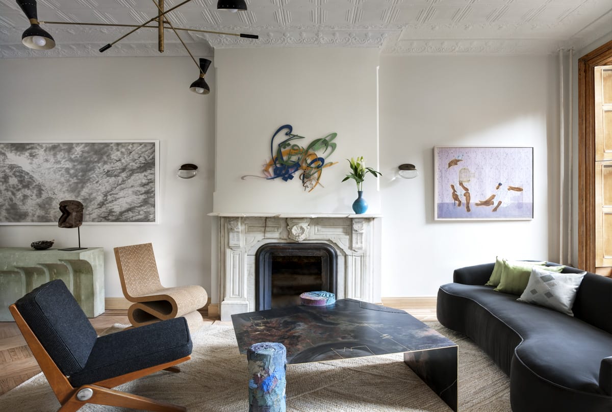
A black-framed poster picks up a black side table. A silver frame catches the same light as a chrome lamp. A deep red in a print reappears quietly in the rug.
Nothing technically matches. The pieces just speak to each other.
That's often enough to make an eclectic room feel coherent. Instead of asking whether an artwork fits your room's “style,” look for one thing it already shares with the space — a material, shape, color, or even the weight of a line.
You don't need a theme. You need a few echoes.
.jpg)
Scale changes the room
Put a postcard-sized print in the middle of a huge wall and it becomes a detail.
Enlarge the same image until it dominates the wall and it becomes part of the architecture.
The sofa gets an anchor. The wall gets a focal point. The room suddenly has hierarchy.
This is where people often play it too safe. Large walls don't necessarily need several medium pieces. Sometimes one 100 × 150 cm canvas or oversized framed poster does far more.
That doesn't mean bigger is always better.
A tiny piece surrounded by a surprising amount of empty space can be just as strong. What matters is variation. If every artwork and object in a room carries roughly the same visual weight, everything starts to flatten out.
So don't just ask whether an artwork fits.
Ask what it's supposed to do.
Anchor the room? Disappear into it? Become the first thing you notice? Interrupt everything around it?
Let the size follow. Luckily, at Printseekers, we offer prints starting from the smallest of sizes, to big wall-art options, like multipanel canvas.
.jpg)
One thing that doesn't belong makes everything better
Most decorating advice is designed to prevent mistakes. Use the same wood tones. Stick to one period. Keep the frames consistent. That’s safe advice.
But interesting rooms usually contain a little disagreement.
A stark black-and-white photograph above an antique cabinet. A gold frame around hard geometric art. A modern metal print surrounded by old wood.
The contrast makes you notice both pieces more.
Put a contemporary photograph beside something obviously old and the photograph feels even more contemporary. The older object, meanwhile, stops feeling quite so dated.
A room where every piece belongs perfectly to the same aesthetic can become strangely predictable.
Sometimes it needs one thing that's slightly wrong, which can add more depth and personality to your space.
Style one corner, not every wall
You don't need to solve the entire room at once. Start with one area and make the relationship between the objects there work.
An oversized framed poster. A low cabinet. One strange ceramic object. A warm pool of lamplight. That's enough.
Now the question changes from “What should I put on this wall?” to “What belongs with this chair, this lamp and this light?”
Wall art becomes part of a scene instead of something used to fill an empty rectangle.One strong corner can give a room more personality than covering every available wall.
The frame changes the picture
People tend to treat the image as the art and the frame as packaging. It shouldn’t always be like that. Take the same print and put it in a black frame: suddenly it feels sharper and more graphic.
Put it in a natural wood frame - it instantly softens it.
Dark wood frame would make it heavier.
Gold can make contemporary work feel almost historical.
Silver or chrome can make an older image feel new again.
The safest frame isn't always the best one. Sometimes the frame should disappear. Sometimes it should argue with the artwork a little.
And the material inside it matters too.
A matte fine-art print absorbs light and feels quieter. Glossy photo paper pushes contrast and saturation. Canvas removes the paper-and-frame relationship almost completely, while a metal print turns the image into something harder and more architectural.
Same image. Completely different object. It’s important to choose the frame of your art wisely, as it can make or break the design of your room. Do it with intention.
Empty wall is doing work too
Not every gap needs filling. One artwork surrounded by emptiness announces itself. Ten artworks together become a group. Both can work.
The mistake is assuming that a bare patch of wall means something is missing.
Give a small print more breathing room than feels necessary, and it can actually gain presence. Leave space around a larger piece, and the room feels calmer.
And look at your art from the doorway, not only from directly in front of it.
What does it line up with across the room? What does your eye hit first? Is something fighting for attention?
Sometimes the best thing you can add to a wall is nothing.
The best walls take years
A genuinely lived-in home is hard to reproduce because you can't order ten years of memories with next-day shipping.
The rooms people remember mix things no mood board would combine: an inherited painting, a cheap print, a photo from a trip, something made by a friend.
Their value comes partly from having arrived at different times.
You don't need to commit to a finished wall — print one canvas from a photo you took five years ago, add a fine art poster months later when you find the right one, re-frame something old when the room changes.
Order one piece at a time, printed when you want it, at the size the wall actually needs.
A home should stay editable — art should move, frames should change, things should keep arriving.
The point
The best wall isn't the one where everything matches. It's the one where you can tell someone actually lives behind it. The rules from the beginning still work. But past the basics, ask better questions.
Does something repeat without being obvious?
Is there enough variation in scale?
Would one wrong-era piece make the room more interesting?
Is there enough empty space?
Is there anything here that could only belong to you?


.png)

